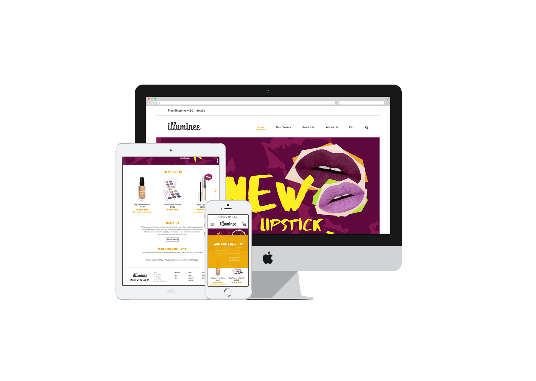
Illuminee is an energetic makeup company that uses honey as its main ingredient in all of their products. The swirling of honey into the makeup allows for a creamy formula that is great for fighting acne and making skin brighter and smoother. Illuminee is targeted at people aged fourteen to twenty two in order to create an emphasis on taking care of your skin starting at a young age. The orange-yellow and dark grey colors were drawn from the honey comb and the bright colors used in the splash images were inspired by eyeshadow colors. Linear cutouts on the splash images were inspired bu the geometric honey combs.
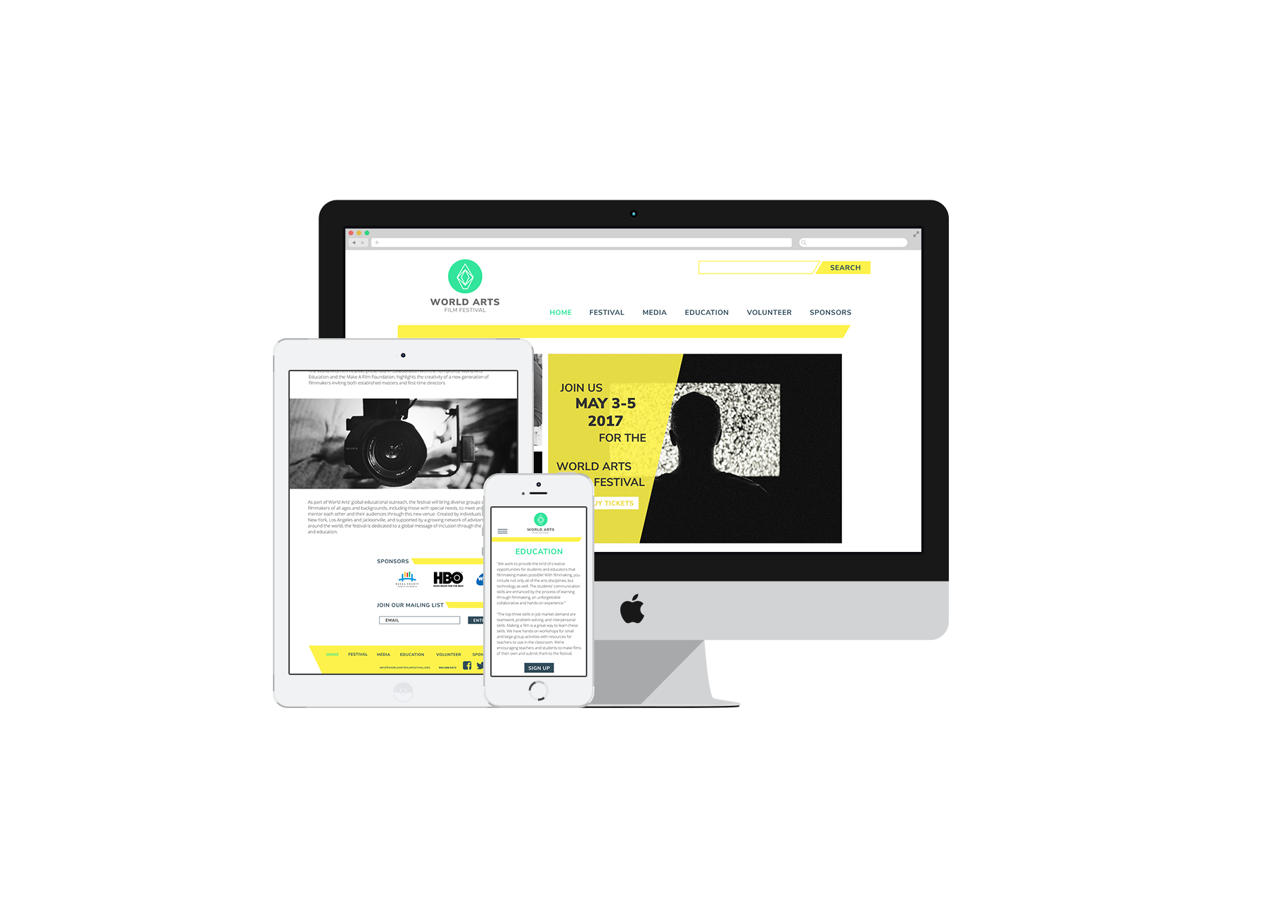
In the Jacksonville, FL community since 2012, the World Arts Film Festival is an event which promotes opportunities in the creative industry for artists and filmmakers of all ages. The World Arts Film Festival redesign creates a well organized site and a more distinct logo for the audience to value. The logo drew its inspiration from a pentaprism which is a five-sided reflecting prism used to deviate a beam of light inside of a digital camera. The logo was then placed inside of a circle to represent the lens of the camera. The neon colors drew inspiration from the old movie theater signs in order to tie in the history of the film industry.
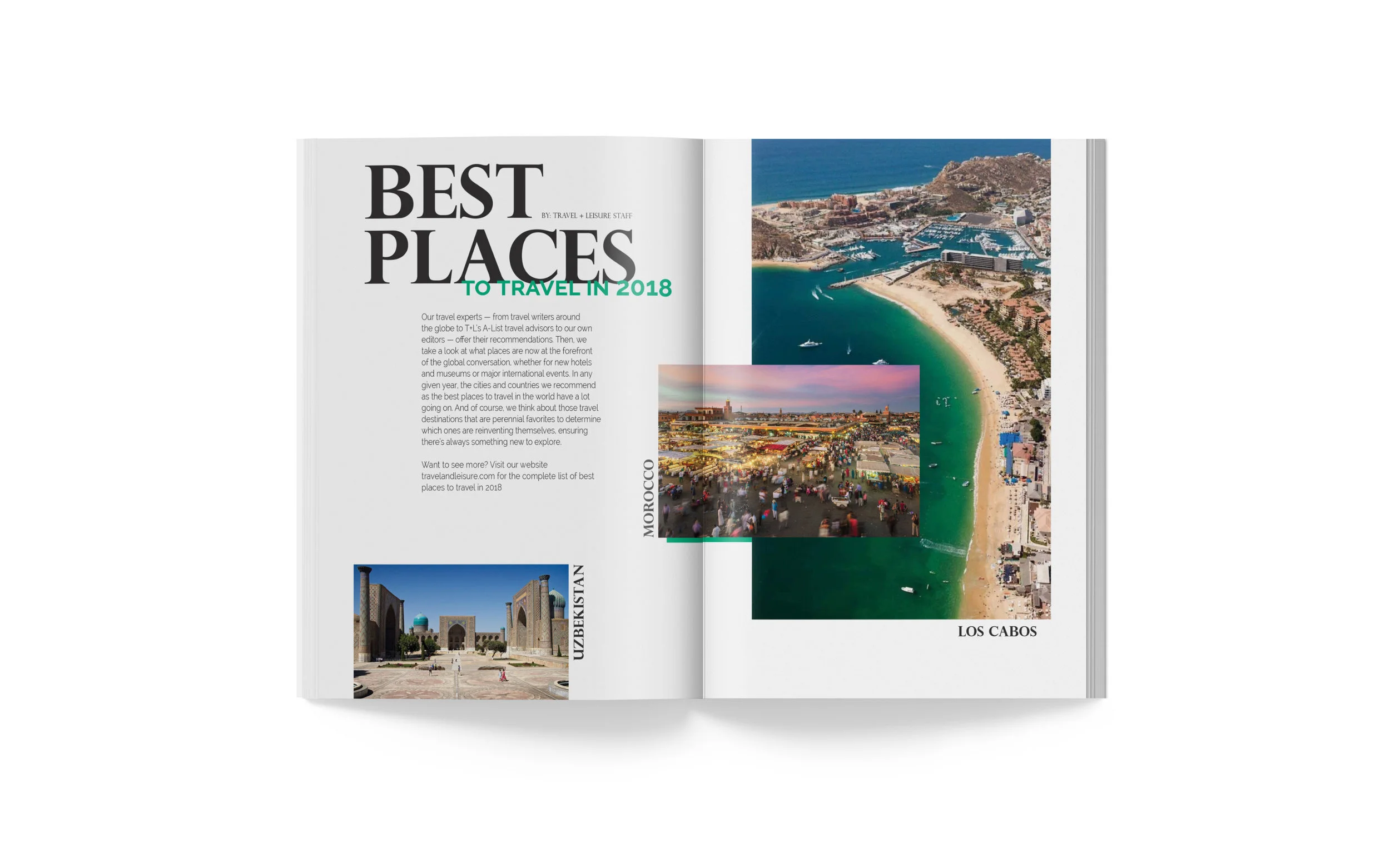
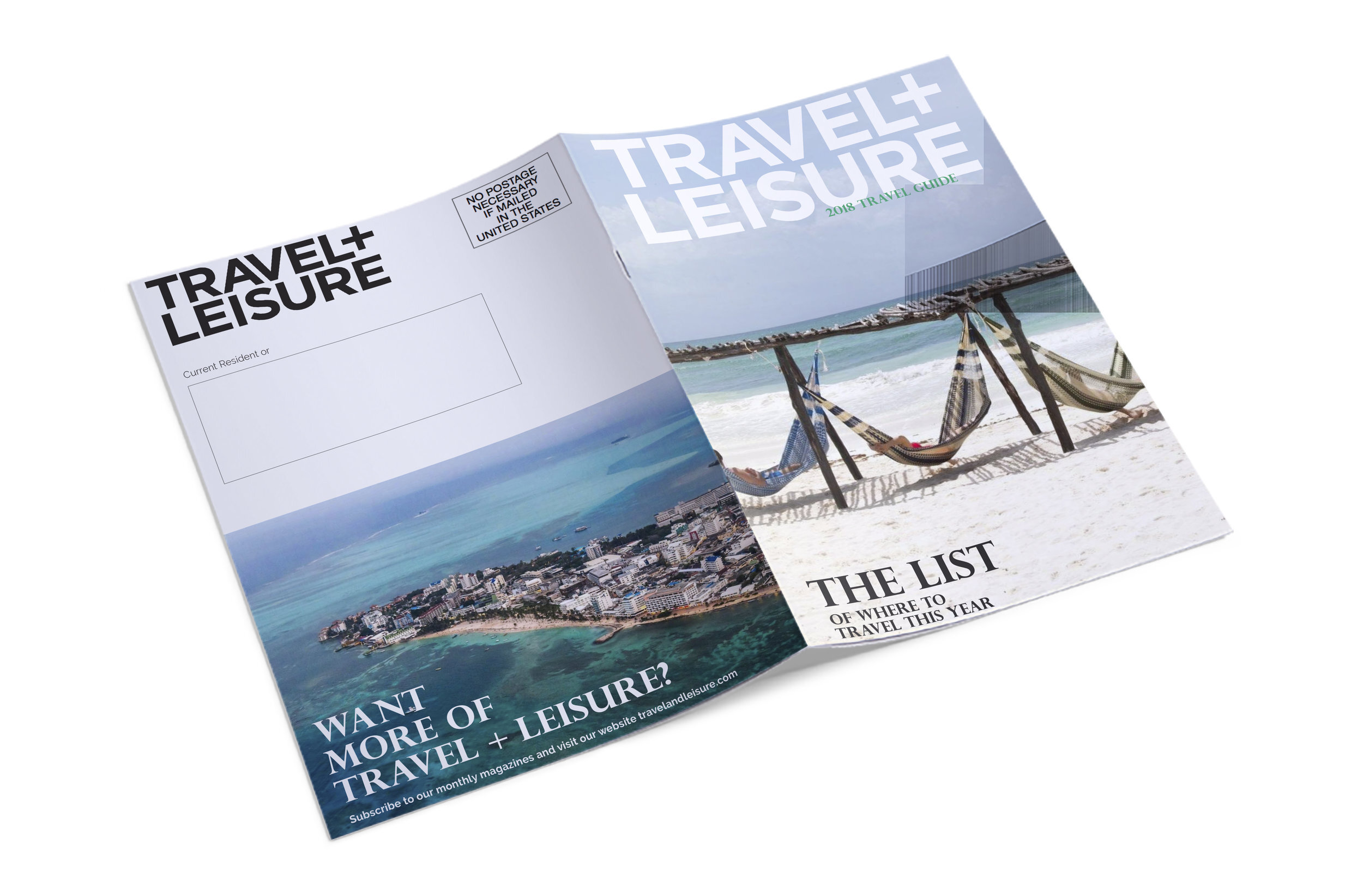
Travel + Leisure is a nationally known magazine company who is always looking to expand their potential readers. This catalog was created to be sent out to potential readers and website visitors to offer just a taste of what Travel + Leisure is all about. The airy spreads offer a precursor to how you will feel on that vacation that you have been meaning to take all these years. The serif font, Perpetua Titling MT, was used in the headers to create a more luxurious fell to the spreads.
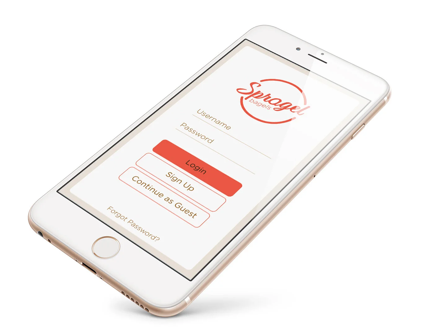
Spragel is a bagel franchise located in Seattle, Washington that is known for their mouthwatering homemade spreads and bagels. Favorites include honey bacon sriracha, garden veggie, blueberry, and pumpkin spreads which pair perfectly with the savory companion of a bagel. Their mobile application allows for effortless mobile ordering and offers an insight into the company. The brown color used in the branding represents the grains used to make the bagels while the red accent color alludes to the rapid service you receive at Spragel.
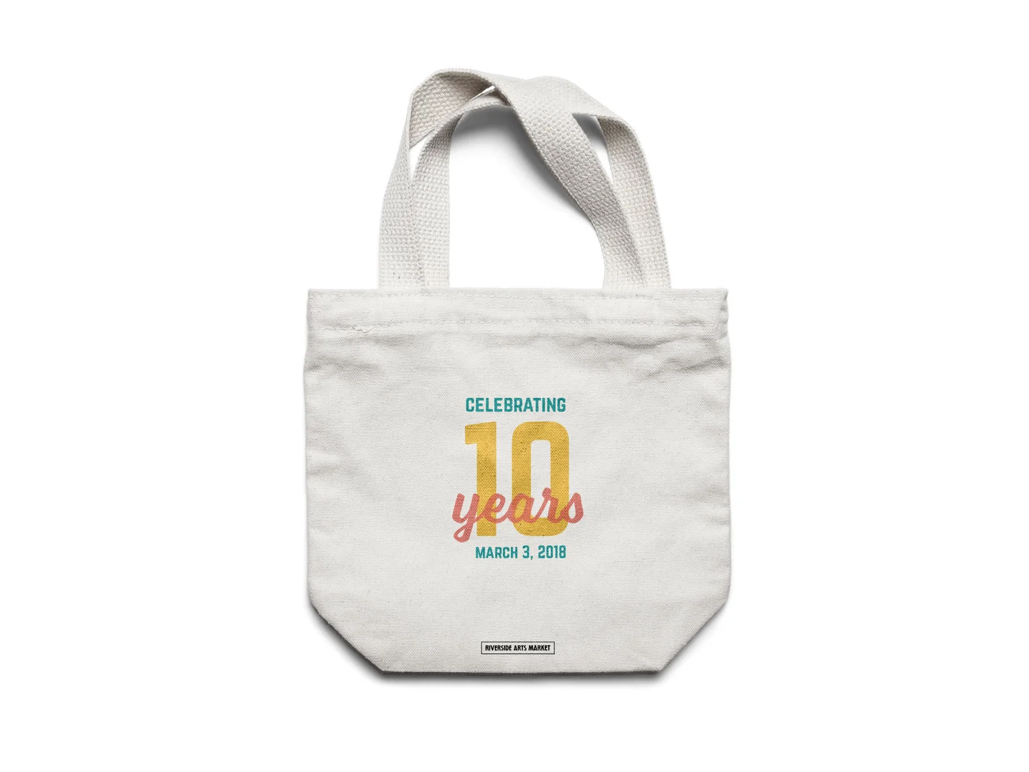
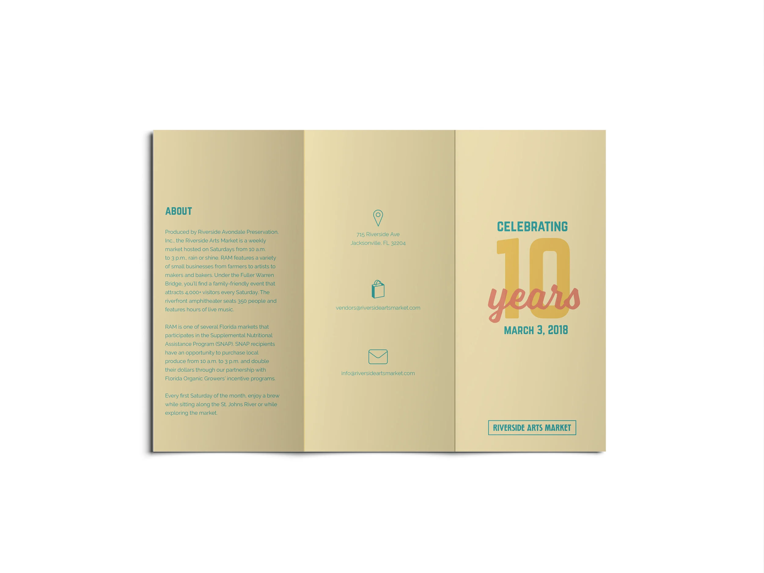
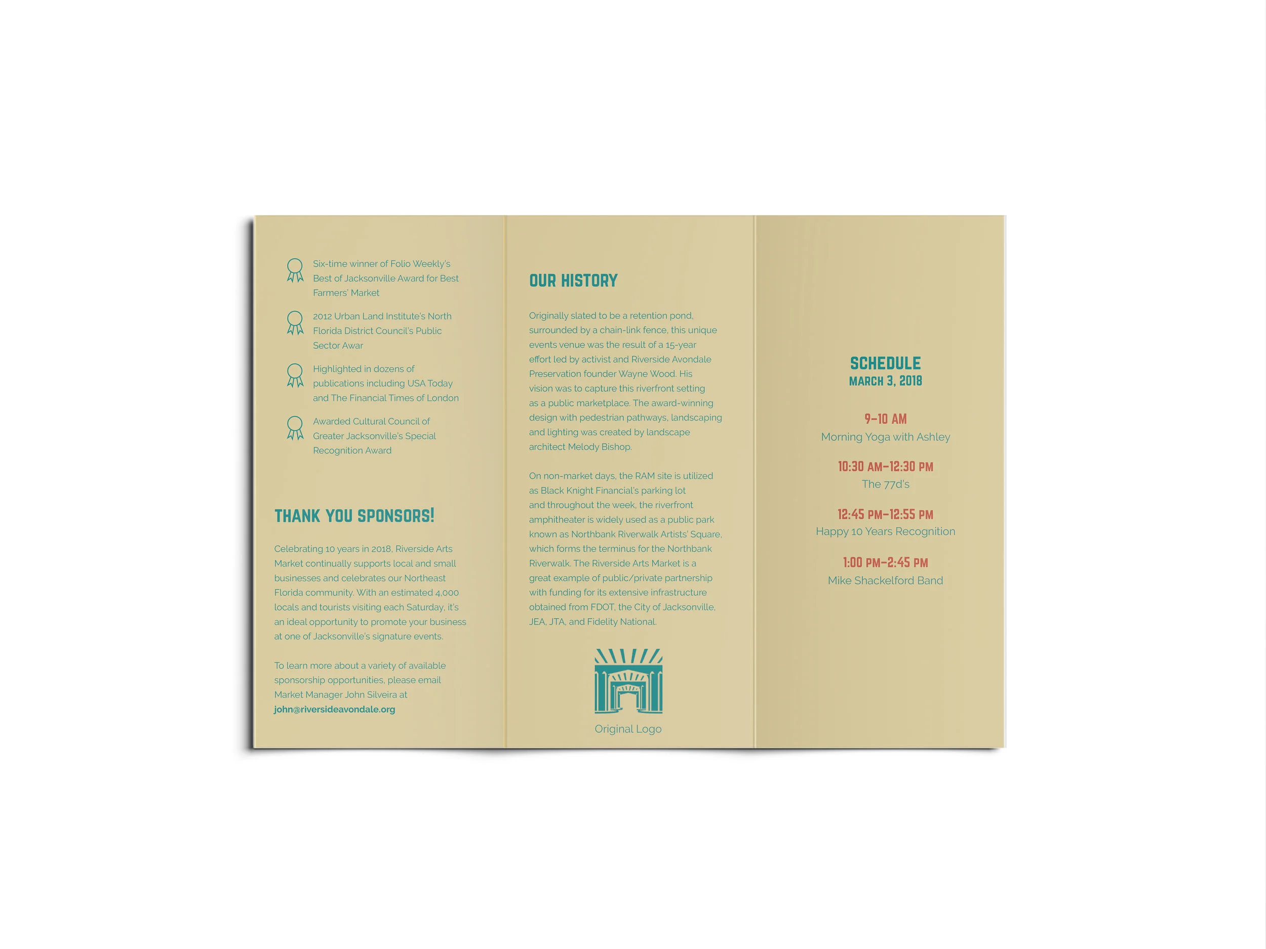
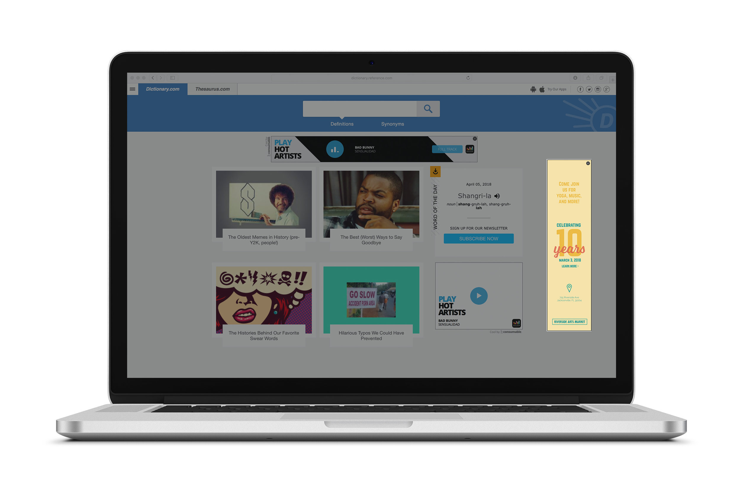
The Riverside Arts Market (RAM) is a weekly market which takes place on Saturday’s from 10am to 3pm in Jacksonville, Florida. RAM features a variety of small business from farmers and artists to bakers and makers. This brochure was created in order to brand their ten year celebration taking place on March 3, 2018. The brochure offers information on what will be happening that day at the Arts Market, as well as history about RAM. A web banner was made to draw attention to computer users who might not now about the market and a bag was created to hand out to the first 350 visitors to the ten year celebration.
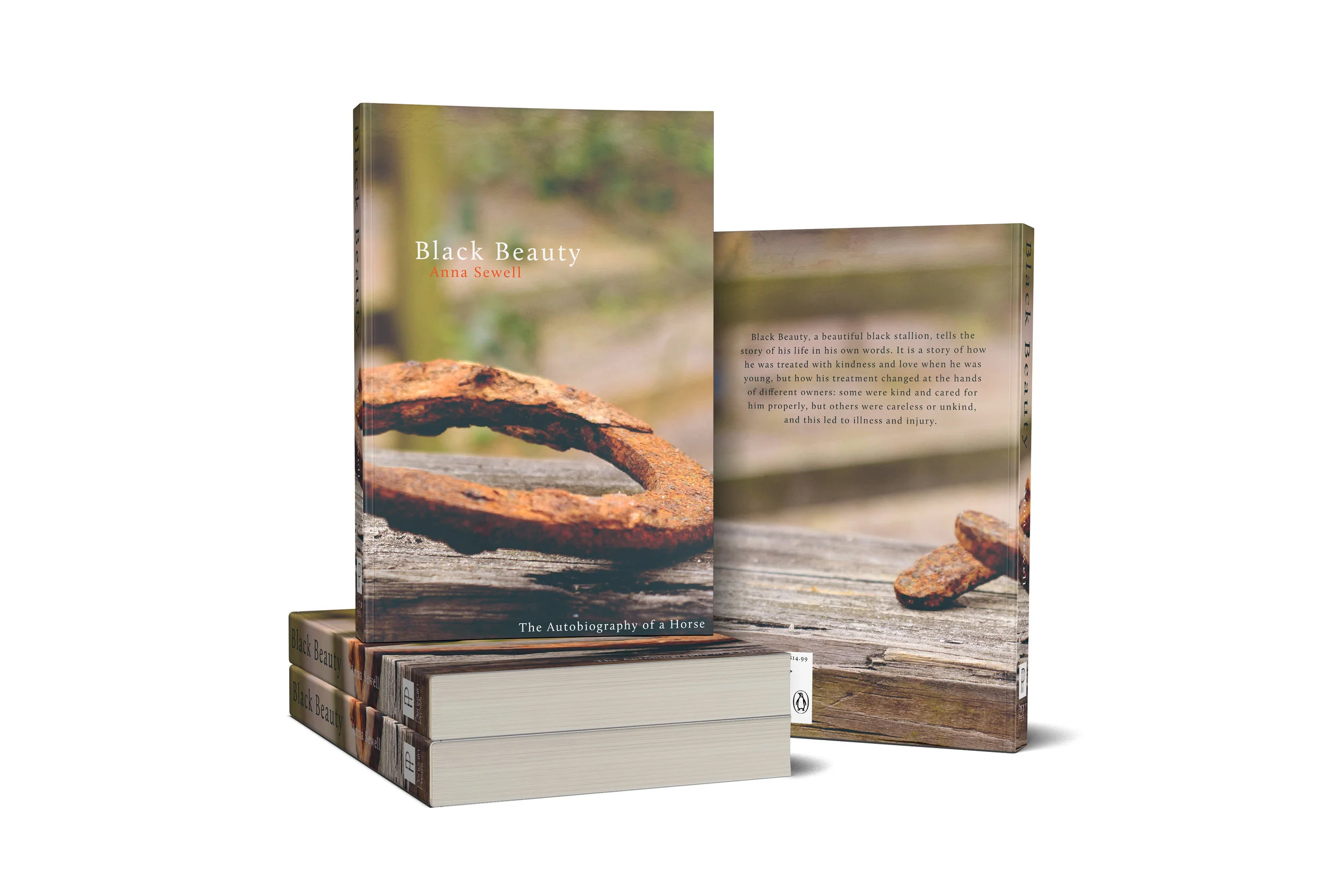
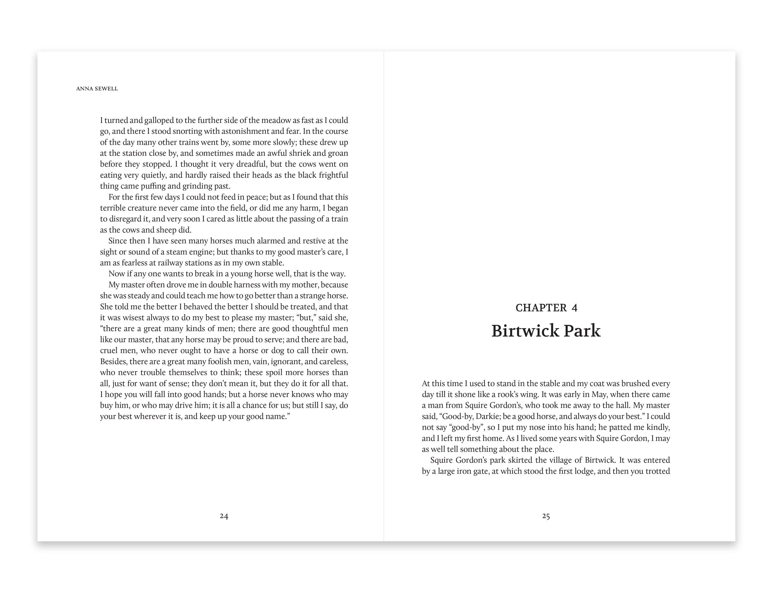
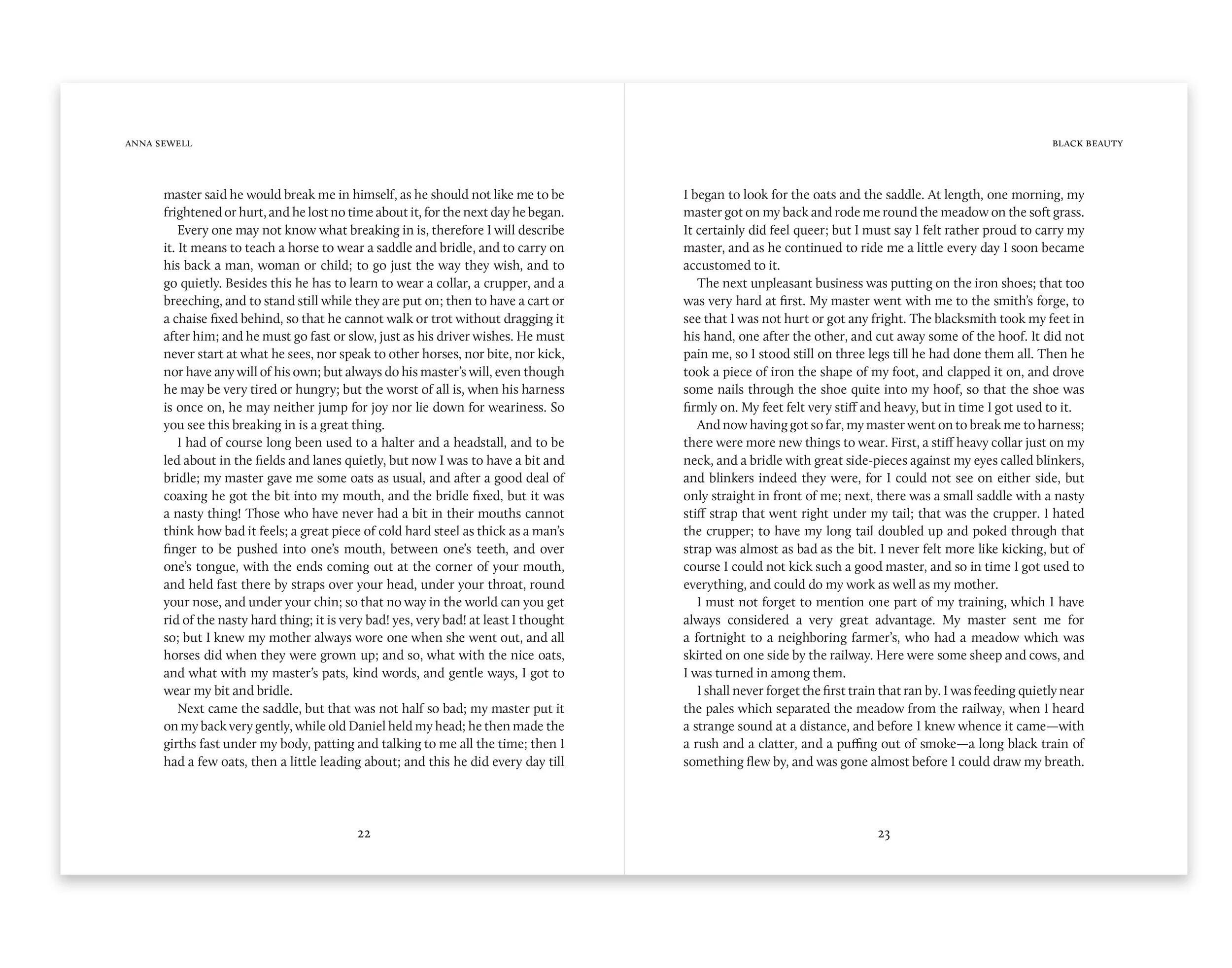
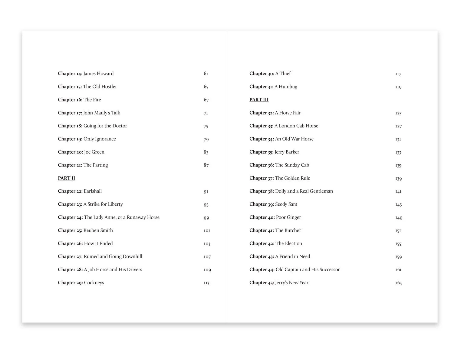
Based in the late 1800’s, Black Beauty is one of the best-selling books of all time. Black Beauty teaches valuable qualities to children while they engage in a charming story of a horses life. The mysterious cover of the book allows for the reader to ponder the life of Black Beauty and consider the long road he went through. The typeface, Volkhov, was used on the headers at the beginning of each chapter and the typeface Calluna was used on the body copy. Larger margins allow for younger audiences to read more comfortably.
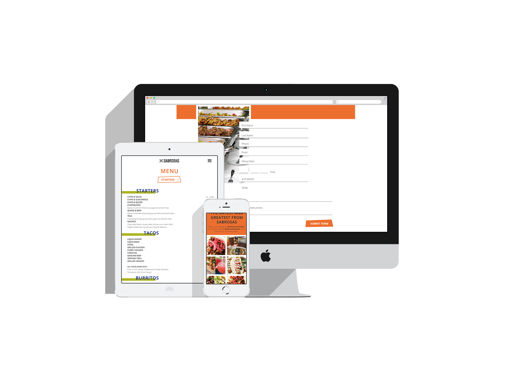
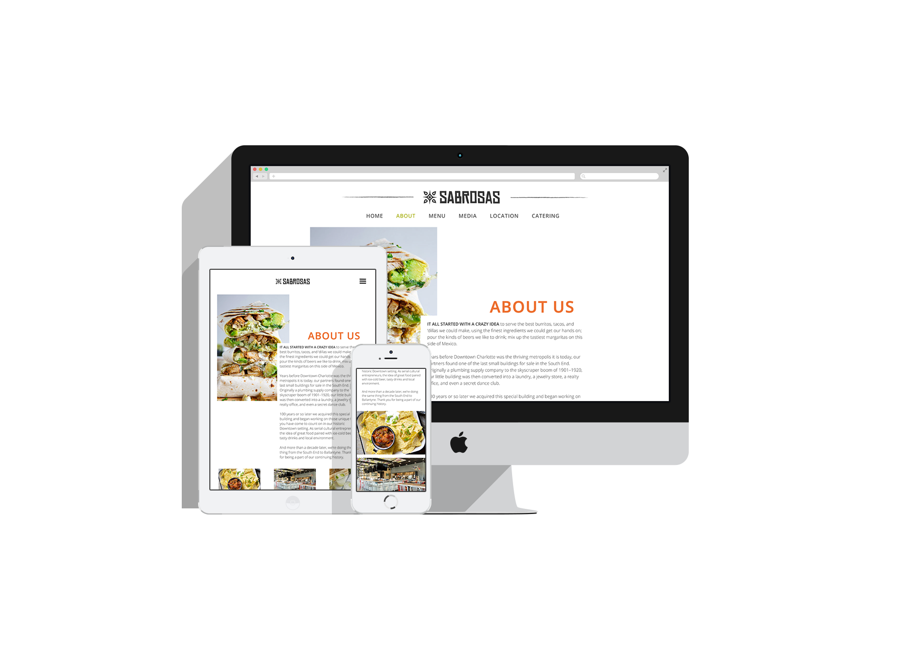
Sabrosas is a Tex-Mex restaurant located in Charlotte, North Carolina. The name Sabrosas translates to tasty in Spanish and is a popular place to hang out and enjoy taco Tuesday at. The logo was inspired by Mexican ceramic tiles and the patterning created on them. Bright colors are woven into the design in order to mimic the zest of the food served.
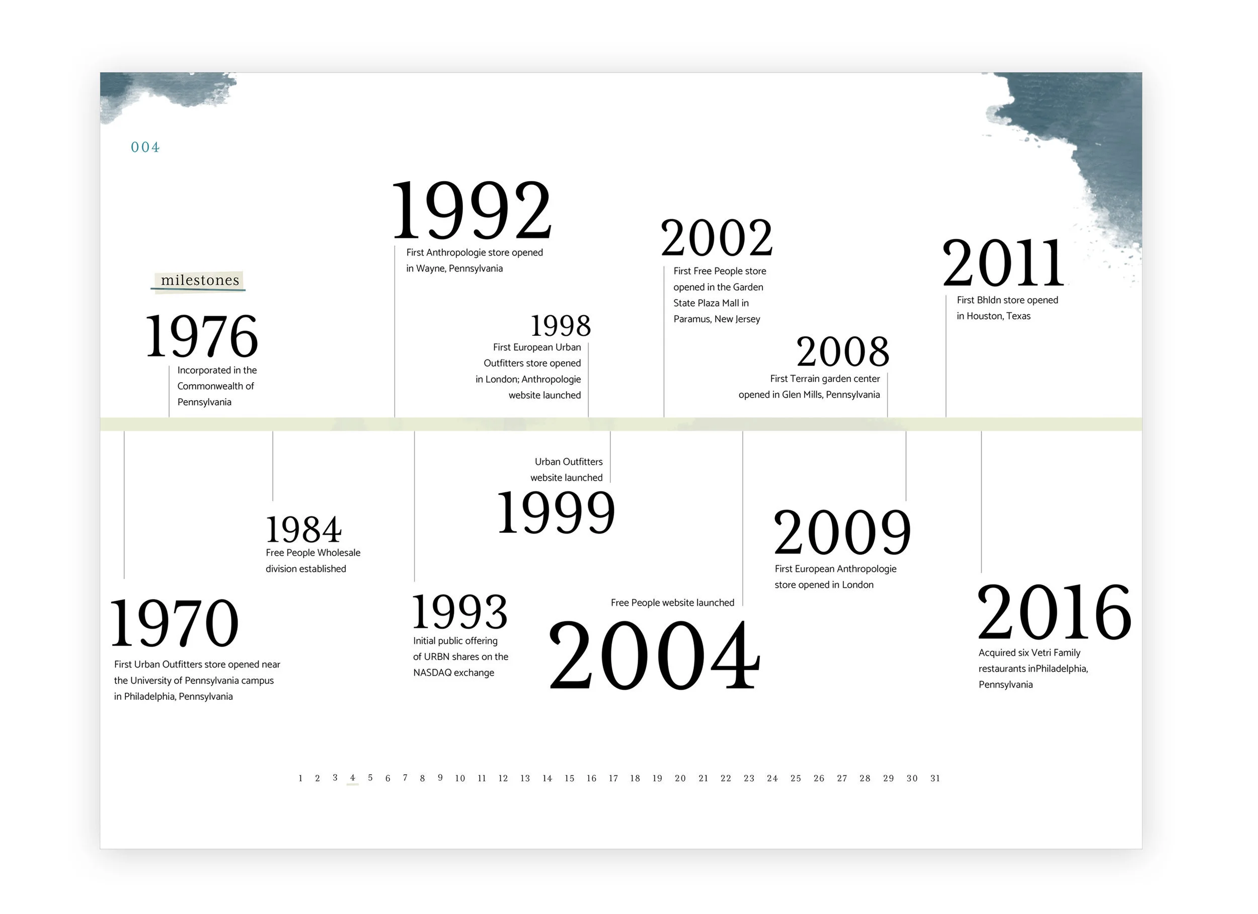
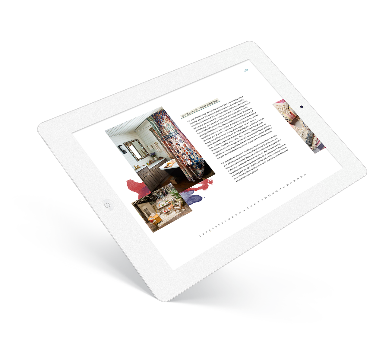
URBN, comprised of Anthropologie, Urban Outfitters, and Free People, is know for their home furnishings and high-end clothing. Each of the stores offer different personalities that are contemporary with the times. This digital annual report mimics that feeling of the stores and provides an organized view of information. The stunning pictures allow for the viewers eye to break from the content that would otherwise seem daunting. Making the annual report digital allows for URBN to stick with who they are as a brand, as they are huge advocators for sustainability.